GEOstudy

Overview
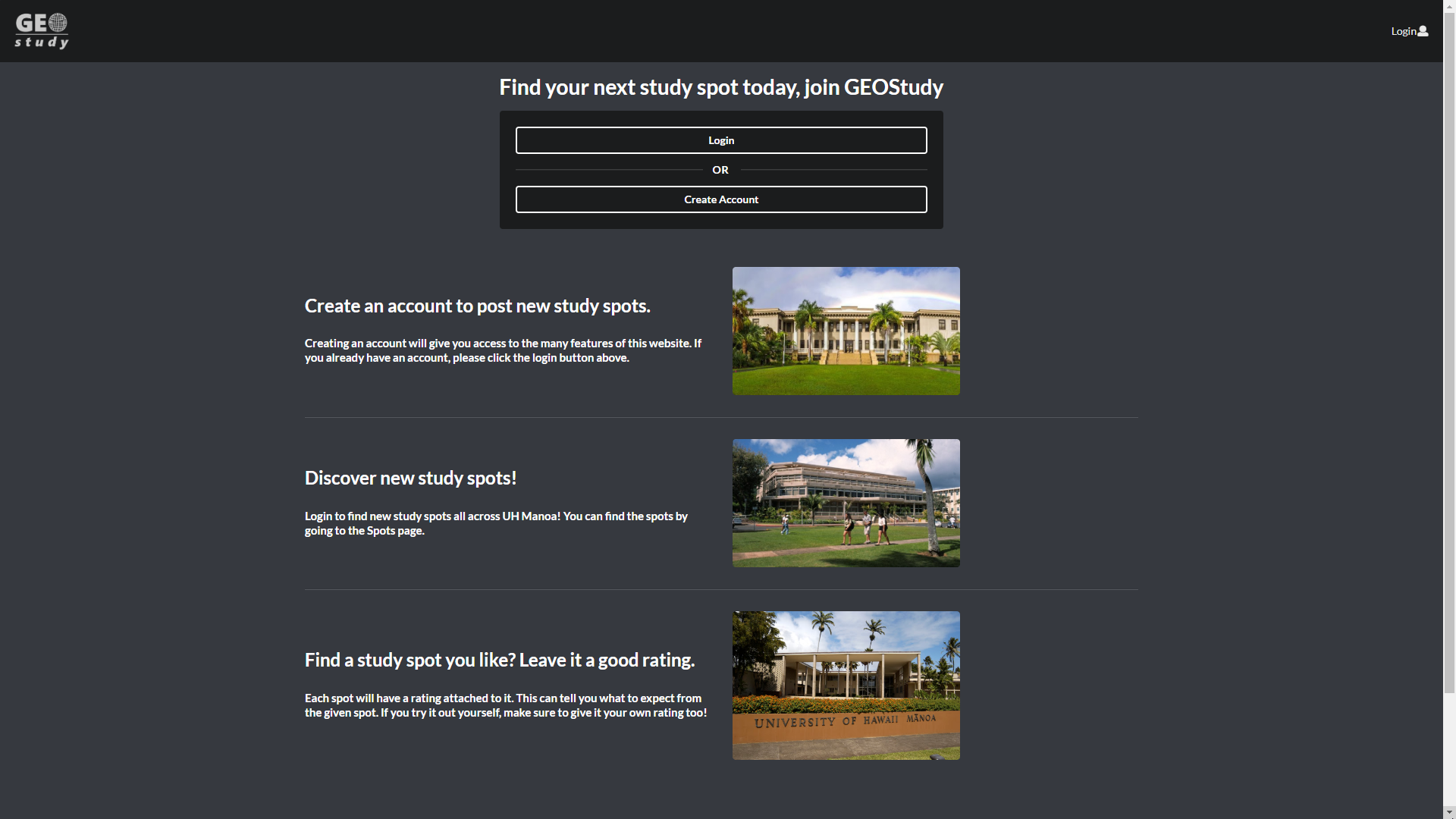
This project was quite the large undertaking at the start. Our group had been assigned to make a website that took user created study locations called “Study Spots” and display information about them while allowing other users to view, rate, and make use of that information to find themselves better places to study.
We used Github to collaborate and used issue driven project management to keep track of our progress and quickly add to the website as we found new issues that needed to be solved throughout our development.
This was a great learning experience for myself as it challenged me to use everything I had learned in ICS 314 up until that point. Meteor to get the website up and running, Semantics UI-React to create the various interfaces in HTML, and Javascript to make the website interactive and function properly. It also added new elements into the mix such as MongoDB and full deployment to Meteor’s servers, though for monetary purposes this working site had to be taken down. At the bottom of the page, a link to our organization’s page as well as access to our home page can get you started in trying out our website for yourself.
Contributions
While I made multiple pages on the website including the Admin centric pages that allowed a logged in Administrator to view various data associated with our website and edit, delete, and add to them as necessary, the largest portion that I had contributed definitely came from the View Study Spots page.

Study Spots Page & Ratings
Within the Study Spots page, logged in users were able to view each Study Spot submitted to the website as well as all the information for each one. Within each Study Spot section, there is a rating component implemented that allows users to view the current rating of each spot as well as how many people have rated it. Below this, the site is able to tell whether the current user has rated the Study Spot and either ask them to rate it if they have tried it, or give them their previous rating and allow them to re-rate the spot, changing their existing rating. This component was interactive and rating a spot or changing an existing one could change the shown average of stars listed.
Owner & Admin Features
The site could also tell whether the user submitted the spot or not and allow the user to edit its information if they were. For admin’s use, a logged in Admin could see the owner of each submitted spot and have access to the edit function regardless of whether they owned it or not. A small delete button is also attached to each spot which allows the Admin to delete a spot and the ratings associated with them.
Tag Implementation
The last component of each page is a tag feature which is a separate list of available words and phrases that help users associate that spot with specific things such as “Sunny”, “Outdoors”, “Indoors”, or “Air Conditioned”. By checking which tags the specific Study Spot is associated with, the site would populate a tag for each one for each of the spots.
While on the surface it may not look like a lot, to implement each piece of the page and get all of the different data to work together was an ordeal of trial and error. As I became more and more familiar with how the structure of the different parts of the different frameworks and Javascript would interact I was able to understand more and more that I could use to further improve the site.
With More Time…
If I were to do this project again, I would definitely do more initial planning to better understand how the data flowed and how each piece of the website worked and what we needed to make the site more fully functional. Without a clear goal, there was a lot of changes and additions that made our beginning a bit of a slow start.
I’d have also liked to have had more time to properly clean up the site and focus on the design just as much as the functionality. While I think the site looks presentable, it could definitely have extra touches here and there to make it feel more personalized and clean.
The last place I’d like to have improved on is the code. The time restraints were difficult and with so much left to finish, functionality and making sure there were no errors had to come before cleaning up. While I deeply regret not being able to keep up to coding standards, I think I still did a good job despite the shortage of time.
Links to the Website
If you’d like to try out the site for yourself, you can find a link to our organization here.
From there you can access both the source files for the website as well as a link to our organization’s home page which can also be accessed here. If you need help getting the site prepared, you may use the table of contents to reach the Developer Guide which explains how to get the site up and running.